
Hierarchy view
Monday.com
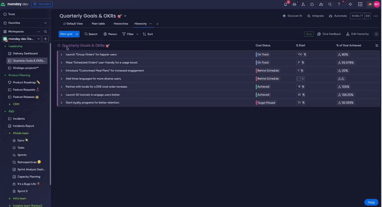
I based the Hierarchy structure on an extended sub-item mental model, using indentation, spacing, and lightweight rows to make up to six levels of work readable on one “mega board.” This keeps depth visible without overwhelming users, and reduces context switching between separate boards.
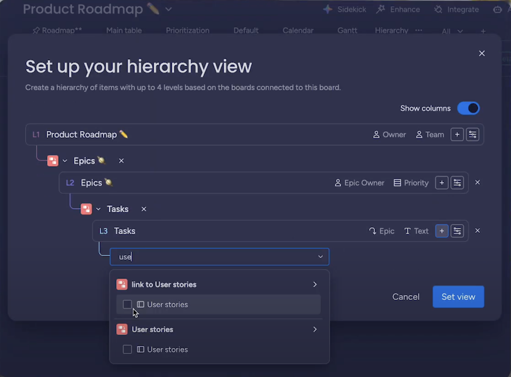
The GA redesign of the “Edit hierarchy” modal reduced setup friction with clearer copy and a cleaner UI, making it easier to configure levels correctly on the first try and supporting the feature’s strong retention.
Overview
Hierarchy view is a multi-level planning experience I designed at monday dev to answer the top request from CROs and Enterprise customers: “let me see all related work in one place.”
The project spanned an end-to-end process—from in-depth user interviews with a major global enterprise customer to translating complex technical requirements into an interface that lets teams plan, track, and update work across multiple linked boards.
A core focus was reducing context switching and cognitive load. The initial concept evolved into a more familiar, sub-item-like experience that effectively creates a “mega board” – a single place where users can move fluidly from micro-tasks to macro initiatives without jumping between boards.
More about the project can be read from desktop
Hierarchy view
Monday.com
I based the Hierarchy structure on an extended sub-item mental model, using indentation, spacing, and lightweight rows to make up to six levels of work readable on one “mega board.” This keeps depth visible without overwhelming users, and reduces context switching between separate boards.
The GA redesign of the “Edit hierarchy” modal reduced setup friction with clearer copy and a cleaner UI, making it easier to configure levels correctly on the first try and supporting the feature’s strong retention.
Overview
Hierarchy view is a multi-level planning experience I designed at monday dev to answer the top request from CROs and Enterprise customers: “let me see all related work in one place.”
The project spanned an end-to-end process—from in-depth user interviews with a major global enterprise customer to translating complex technical requirements into an interface that lets teams plan, track, and update work across multiple linked boards.
A core focus was reducing context switching and cognitive load. The initial concept evolved into a more familiar, sub-item-like experience that effectively creates a “mega board” – a single place where users can move fluidly from micro-tasks to macro initiatives without jumping between boards.
The Challenge
Managers users struggled to manage hierarchical work across multiple boards, which led to:
- Constant context switching between boards
- Fragmented visibility from epics to tasks
- Existing tools (like sub-items) that weren’t robust enough for multi-level, cross-board use cases
Key Design Decisions
- Visual hierarchy: Refined spacing, levels, and placeholders to reduce visual noise and make deep structures scannable.
- Interaction model: Shifted from an accordion-style pattern to behavior that mimics sub-items, lowering the learning curve by building on existing mental models.
- Smart automation: Enabled automatic linking of items created deeper in the hierarchy and allowed inline editing directly within the view, so users don’t have to jump out to other boards.
Solution
I designed a unified view that supports up to six levels of hierarchy, allowing users to:
- Drill down from high-level Epics to granular Tasks in a single place
- Navigate up and down the hierarchy without losing their place
- Work with cross-board data as if it were one coherent structure
Impact
The feature became a “game changer” for Enterprise accounts and a key deal enabler in sales conversations.
- A 46.1% retention rate showed that nearly one in two users who tried the feature continued using it regularly.
- The interaction and structural design were strong enough to support a design patent filing.