
Viewpoints Funnel Redesign
Meta
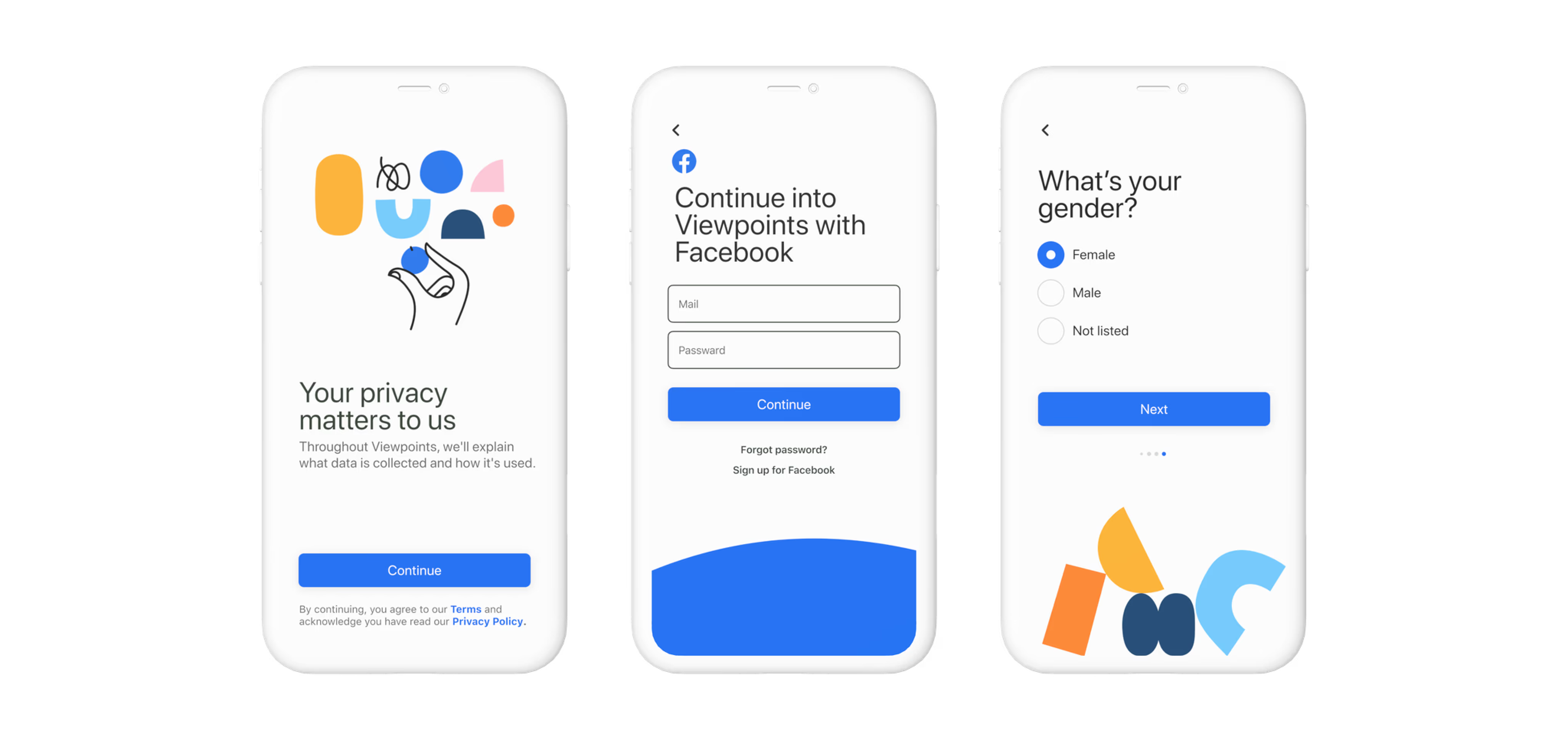
Part of the project was considering the differences in the designs for IOS, Android, small and big screens.
Overview
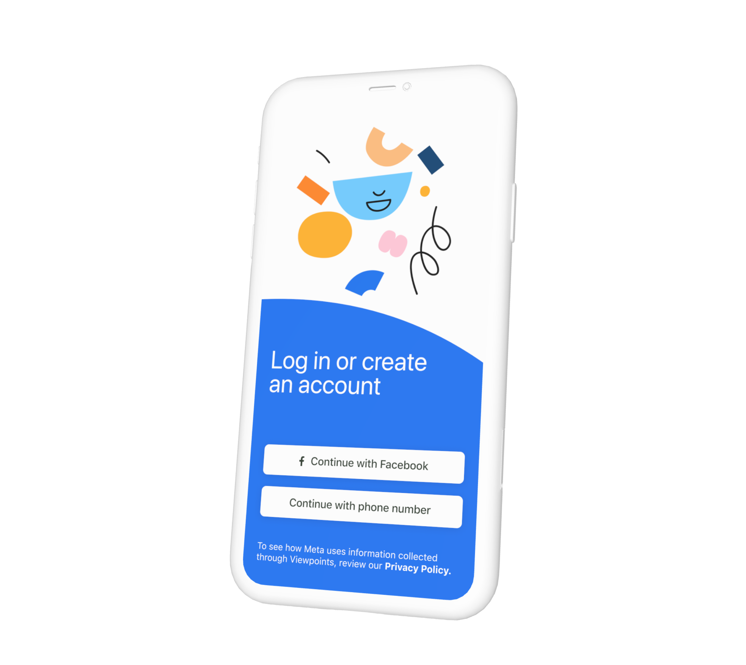
Redesign of the Viewpoints app funnel at Meta to improve user engagement and completion rates.
More about the project can be read from desktop
Viewpoints Funnel Redesign
Meta
Part of the project was considering the differences in the designs for IOS, Android, small and big screens.
Overview
Redesign of the Viewpoints app funnel at Meta to improve user engagement and completion rates.
Challenge
Addressing unnecessary friction, complexity, and multiple failure points that led to low completion rates and high acquisition costs.
Goal
Improve funnel completion rates, therefore improving cost efficiency → reduce costs.
Solution
Simplified language and minimized cognitive load, making the app easier to use.
Improving funnel completion rates by reducing friction and creating an intuitive, consistent UI.
Enhanced reliability and performance, tailored for iOS, Android, and all screen sizes.
Decreasing acquisition costs while increasing efficiency and user satisfaction.
Anactode
To convince the team of the need for a redesign,
I presented my onboarding experience with Viewpoints through a detailed presentation. It included a user journey of the existing funnel with timing, screenshots, pain points, and design heuristics. By analyzing this information, I helped the team clearly understand the necessity of a new design.